Posts

December 8th, 2017 Gallery Showing

Image
Today, I went to a Gallery Showing at Julio Fine Arts Gallery. At this showing, I saw a variety of student's art pieces that were very interesting and unique. One student's art work that I liked was Saadiq Coakley. This student named the artwork, Visions: Far and Near. The student used archival digital prints as the medium. The photographs were of landscapes and areal views, in which he used a drone to capture. I particularly liked this work because I am a fan or photographs in generally and really like landscape photos, like the bridge that you see below. I think that having a drone take the picture from above was a really nice perspective too because we can't see that view at eye level and it gives you the ability to see the landscape as a whole. I also enjoyed looking at Katelyn Herearty's work. She took photographs of her closets friends and blew them up to a larger scale on a canvas and then outlined them in colorful flowers. Each color represented her perspecti...
Joyce Yu-Jean Lee Talk Event (11/15)

Image
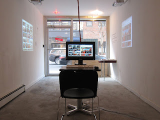
Tonight, I attended artist Joyce Yu-Jean Lee's talk about her artwork, sponsored by the Fine Arts Department. Lee's is based in New York City and her work focuses on video, installation and performance. Her technology based artwork represents culture issues and topics that are current in the world. Her work has been recognized by the New York Times, Washington Post, Huffington Post and more. After listening to Lee talk about her aspirations for her artwork and all that she as accomplished, I was inspired by her work and the meanings behind them. One specific artwork of Lee's that captured my attention was "Firewall: Internet Cafe." This social and engaging art project focused on what the Internet depicts of certain words when searched in the United States or in China. In this project, Lee's goal was to investigate online censorship between two different search engine, Google (used in the United States) and Baidu (used in China). Lee was interested in discove...

Tufte Video

I thought it was interesting how the video discussed cartography and how the first maps were made this way about 6,000 years ago. The first map was created by scratching directions into a piece of stone. Its interesting how this visualization resulted into technological maps that we use today such as Google Maps. The same ideas and concepts of designing a map remain the same; however, the processes in which they are made, scratching it into stone opposed to designing it on a computer, and different. Yet, people still use maps the same way in that they are doing something with it. I didn't realize that Google Maps came from the concept of cartography and I found it interesting how the processes of cartography and its relationships with designing maps evolved. I also thought the way the video described data visualization as a linear process of decision making was interesting. Our brains are constantly working and activity is always present. Our brains work in a way that we analyze ...

Postmodernism Finish Project

Quote: " The great person is ahead of their time, the smart make something out of it, and the blockhead, sets themselves against it." When looking at my finished Postmodernism project, the denotative aspect of this piece is a picture of different size clocks building off of each other in an outward movement. The times on the clocks are all different. On top of the clocks are images of men either reading, running, changing the time of the clocks or standing around looking confused. Albert Einstein is even on top of one of the clocks. After printing the photoshop image, gluing it on the Bristol pad and expanding on the photo, I continued creating the clocks that were cut off the image and also added circles or bubbles around the clocks. These circles/bubbles look the same as the clocks in that they are different sizes and in the color black; however, they do not have ant numbers or time on them, they are just plain. The background is a faded/streak pink col...

Postmodernism

Image
After reading these articles I was a little confused. I followed along how they talk about Postmodernism; however, when they started to talk about Disneyland I got a little confused. I also had a difficult time interpreting the culture and the woman the article was talking about on the first page in the first paragraph. From what I got out of Postmodernism, these artist create art that represents the unknown. As the article states, postmodern artists and architects take note of new messages, symbols, culture and media and then transforms them into videos, songs, painting or buildings, reflecting the ideas of postmodernism. Personally, I feel like it can be difficult to be a postmodernism artist because you have to represent the unknown and in a form of art. I don't think I would be a great postmodernism artist because I believe that I am not as creative and would have difficulty representing the unknown and understanding it in general.

Colors Podcast

Image
I thought it was interesting how the podcast talked about where is the color and where does it come from. When the two hosts talked to the neurosurgeon, they discussed if a grape is the same color for everyone, a human, a dog and a whale etc. The neurosurgeon then stated the question  “would aliens see this red.” Then the conversation turned to how color is percieved in a different ways by different living things. This reminds me of how sometimes, humans take color and what they are able to see for granted. Most people can see all of the colors of the rainbow, but has the podcast was discussing, 10% of men are color blind and dogs color vision consist of blue and yellow. Therefore, not everyone sees color the same. I think as humans we often forget that and we take advantage of the different colors that we are able to see. I think if humans experienced life without color or being color blind, they would have a different experience of the world. Additionally, I thought it was ...

White Assignment

Image
For this assignment, I used my white bracelet and placed it on top of my white folder. When comparing these two, I could tell that there was a difference in the type of white color the objects were. When I changed the lighting, the difference in color changed darker